iOS application UI design User experience Beta
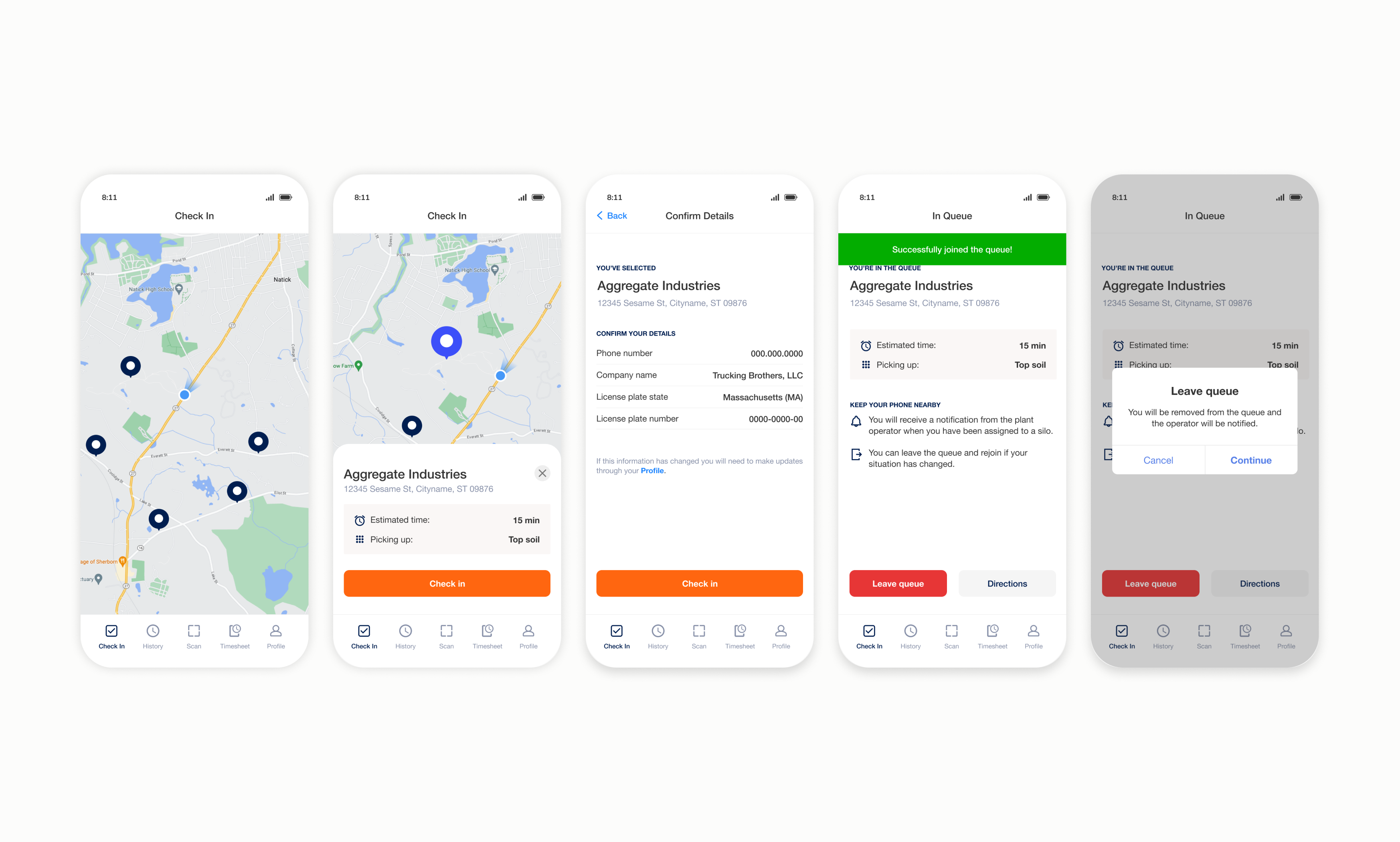
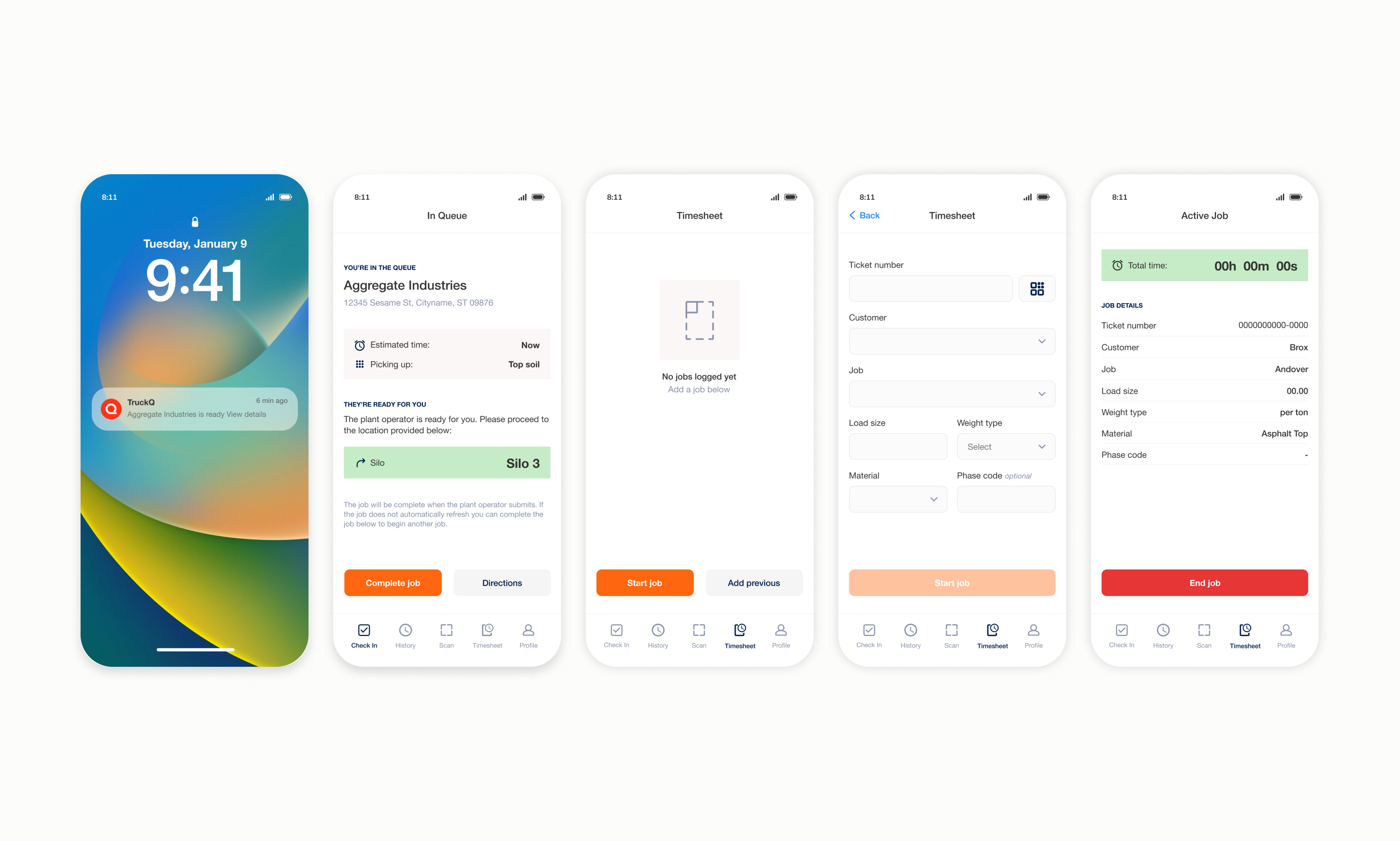
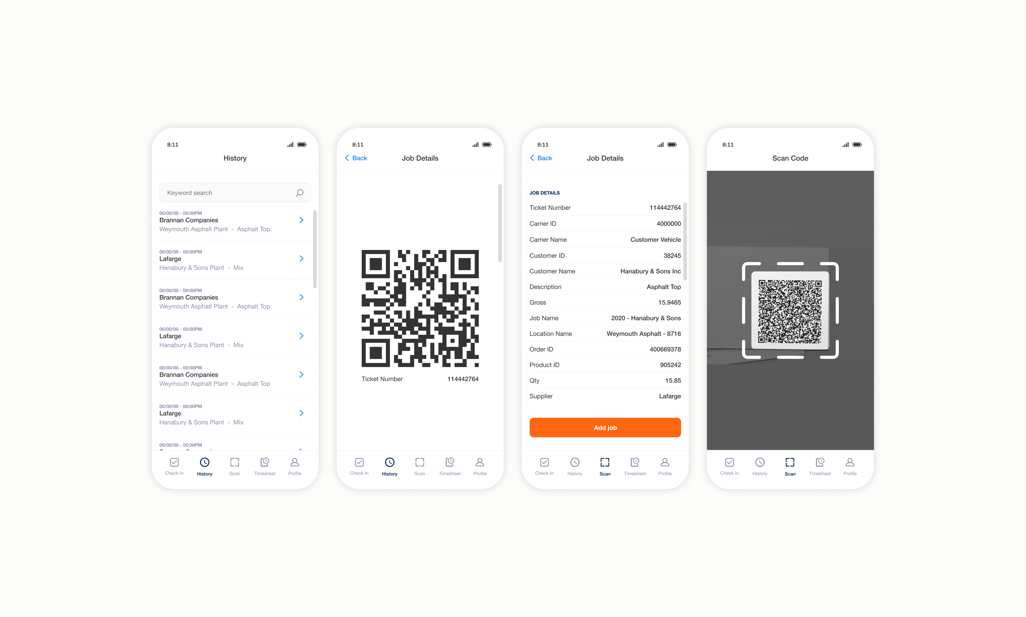
TruckQ is a mobile application that helps truck drivers streamline their day. By providing estimated call times, TruckQ reduces wait times at job sites, freeing up drivers to use their time more productively. TruckQ also eliminates paperwork by letting drivers track current jobs, load previous jobs, and submit jobs to operators for payment electronically.
"The trucking industry is heavily reliant on physical paper and a driver's time is mostly spent sitting in their truck with nothing to do but wait."
Reduce a truck drivers' reliance on physical paperwork, which opens the door to data entry errors and lost documents, sometimes resulting in non-payment.
Help truck drivers save time and be more productive by making their day as efficient as possible leaving them time to pick up additional jobs, complete administrative tasks, or even run personal errands.
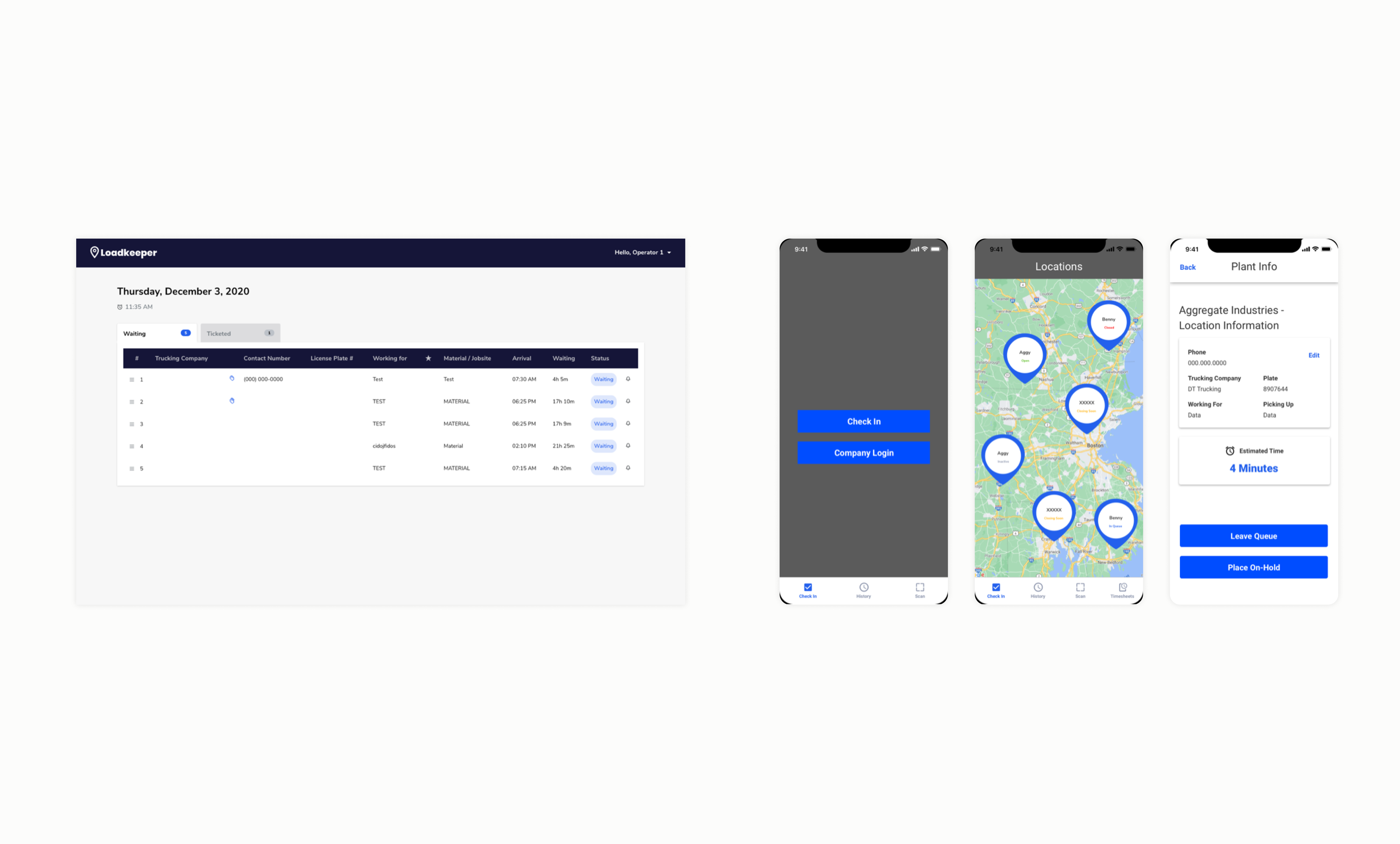
TruckQ relied on LoadKeeper, a web-based portal used by plant operators to log data and call drivers. I learned how LoadKeeper worked and spoke to the offshore engineering team to understand how its data could be used in TruckQ. The team had already begun developing functionality based on loose requirements. I interviewed the CEO, VP of Product, and a Product Manager to define and document the MVP requirements.
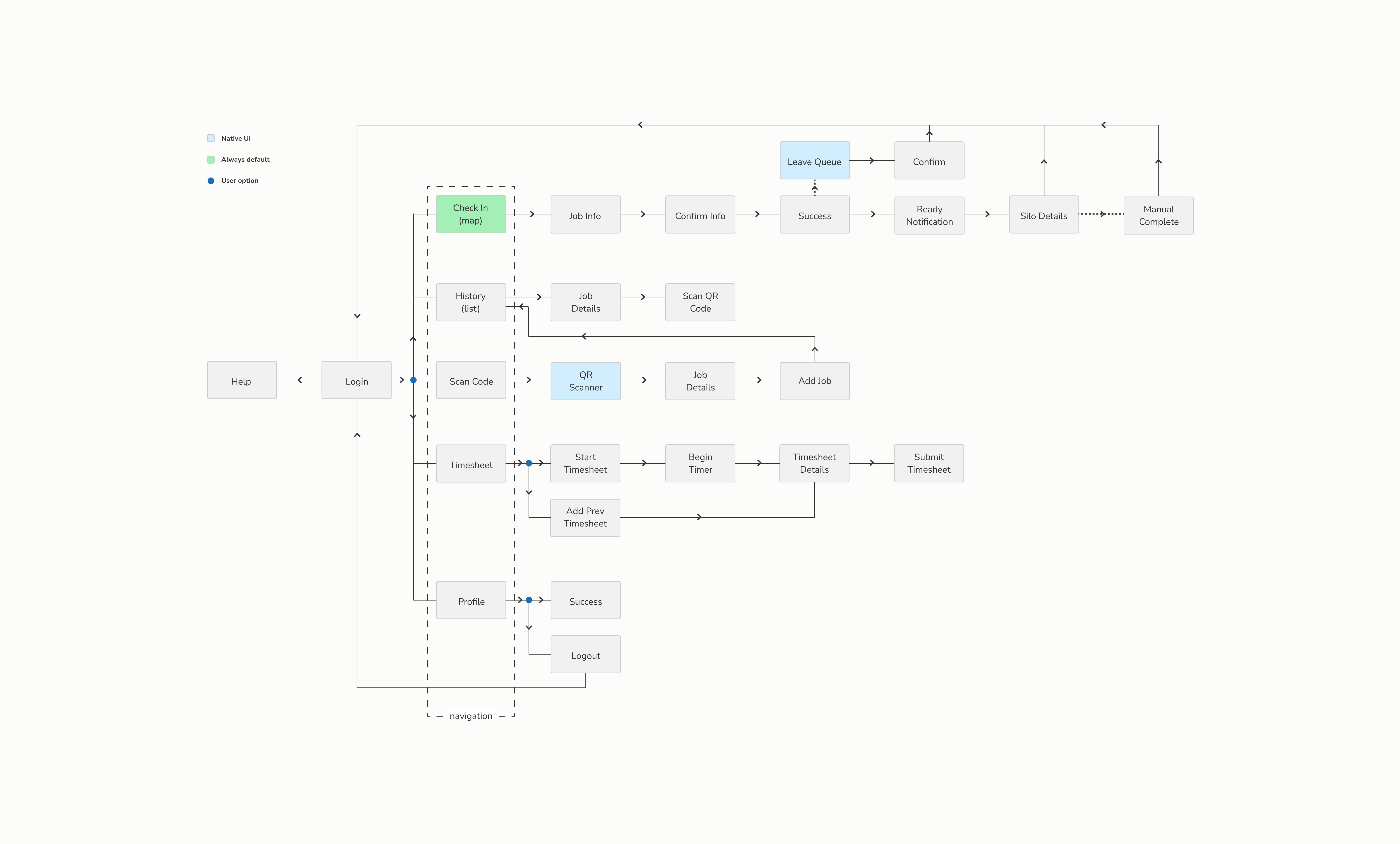
To define the most helpful information for drivers, I reviewed the raw LoadKeeper data and distinguished between "must-haves" and "nice-to-haves." Since teams were working in parallel, a key research outcome was to document the target user and define the user flow, removing unnecessary functionality.
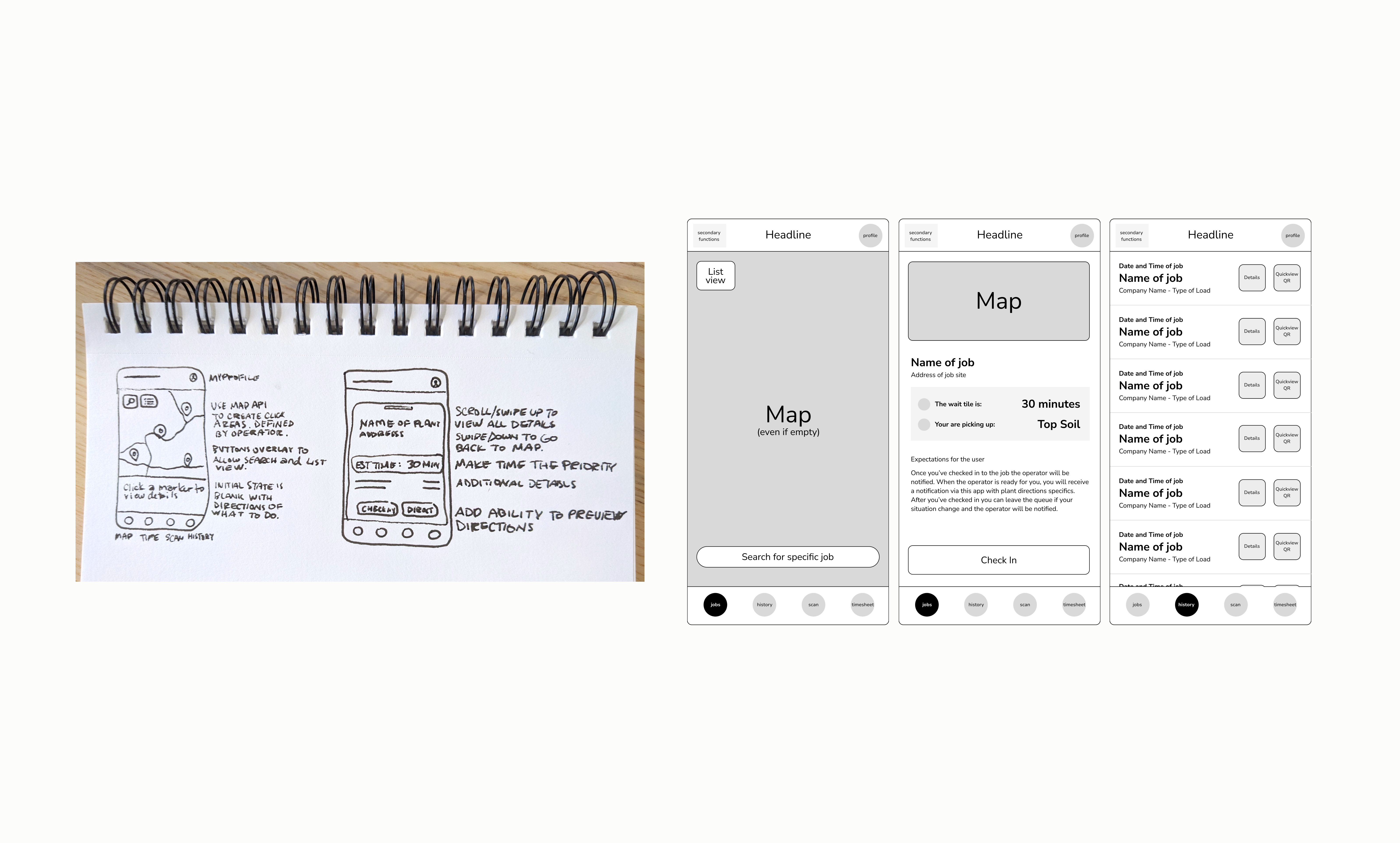
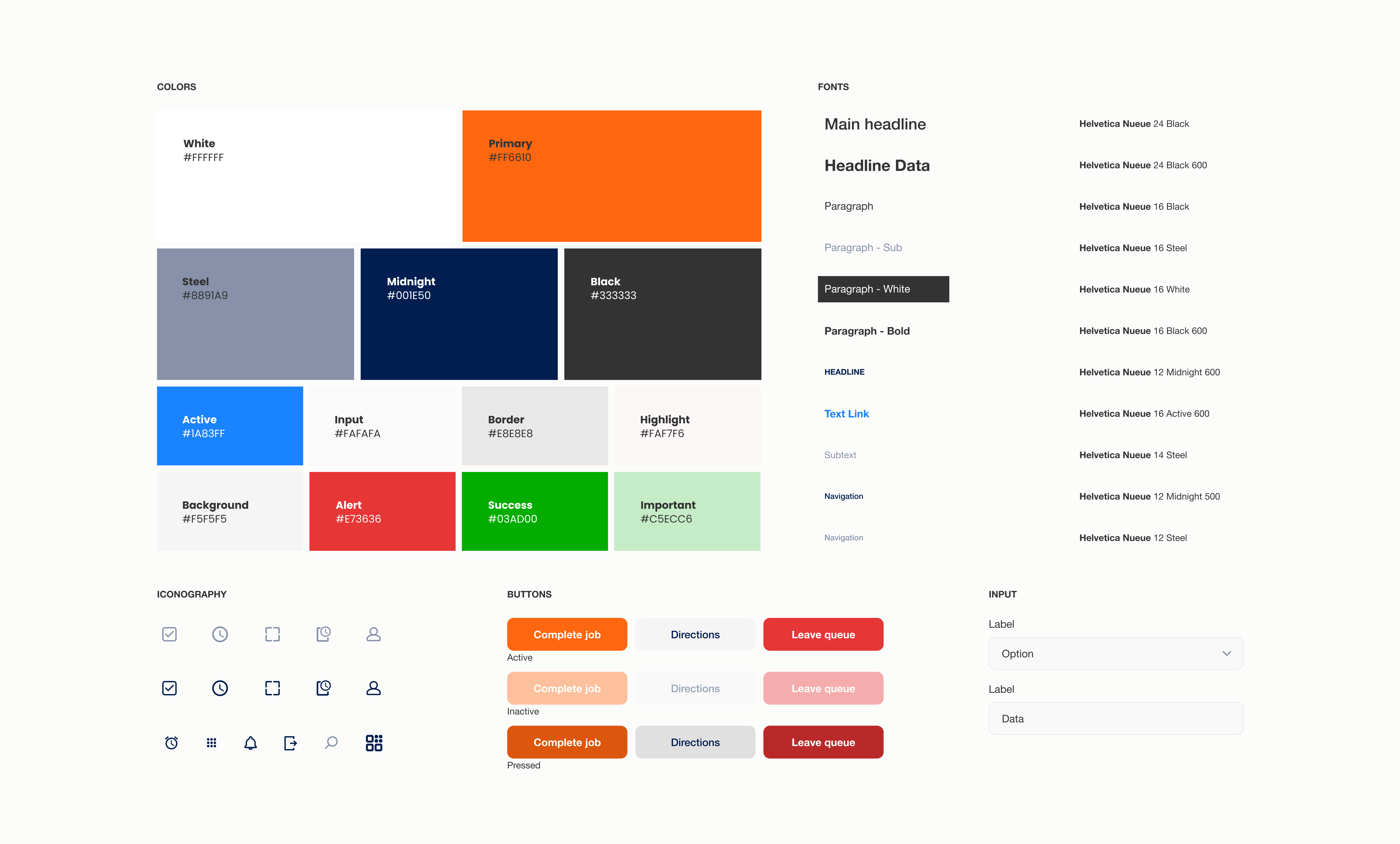
The final design focused on simplicity and reused components from the engineering team's existing library. We documented and reviewed page structures and new design components before creating tickets.
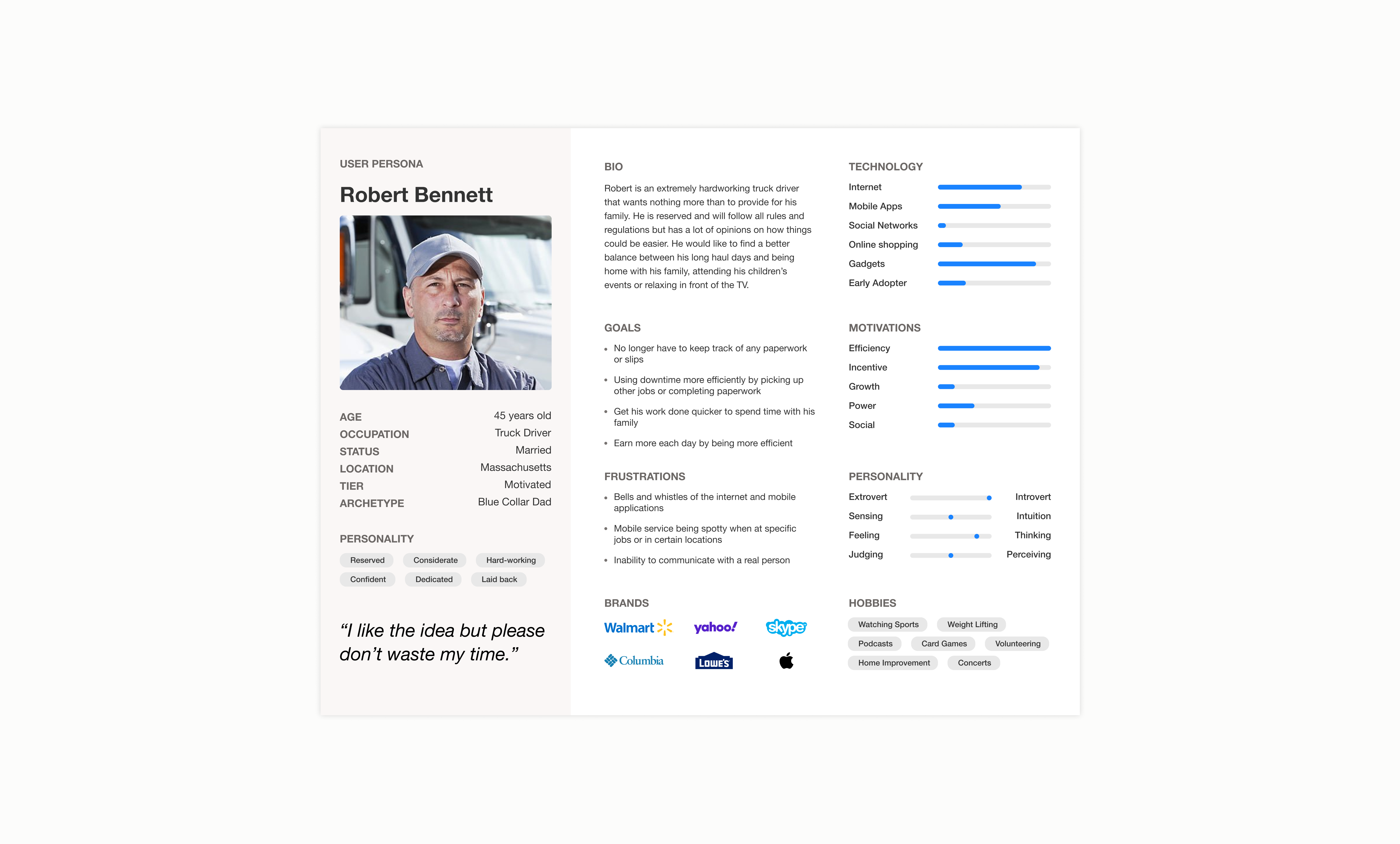
Instead of using standard iOS interactions (swipe, hold, etc.) as I suggested in my initial concepts, we decided to rely on more defined user actions with buttons or links. This better aligned with how our main persona, Robert, would want to interact with the app.
We released a beta version of the app to a small group of customers and their drivers. We established a feedback loop through the sales team to understand real user pain points and solicit enhancements.
Notable requests included keeping old timesheets, direct communication with job site operators, and a list view of open jobs with filtering by weight, company, and type of haul.