Responsive web User interface User experience
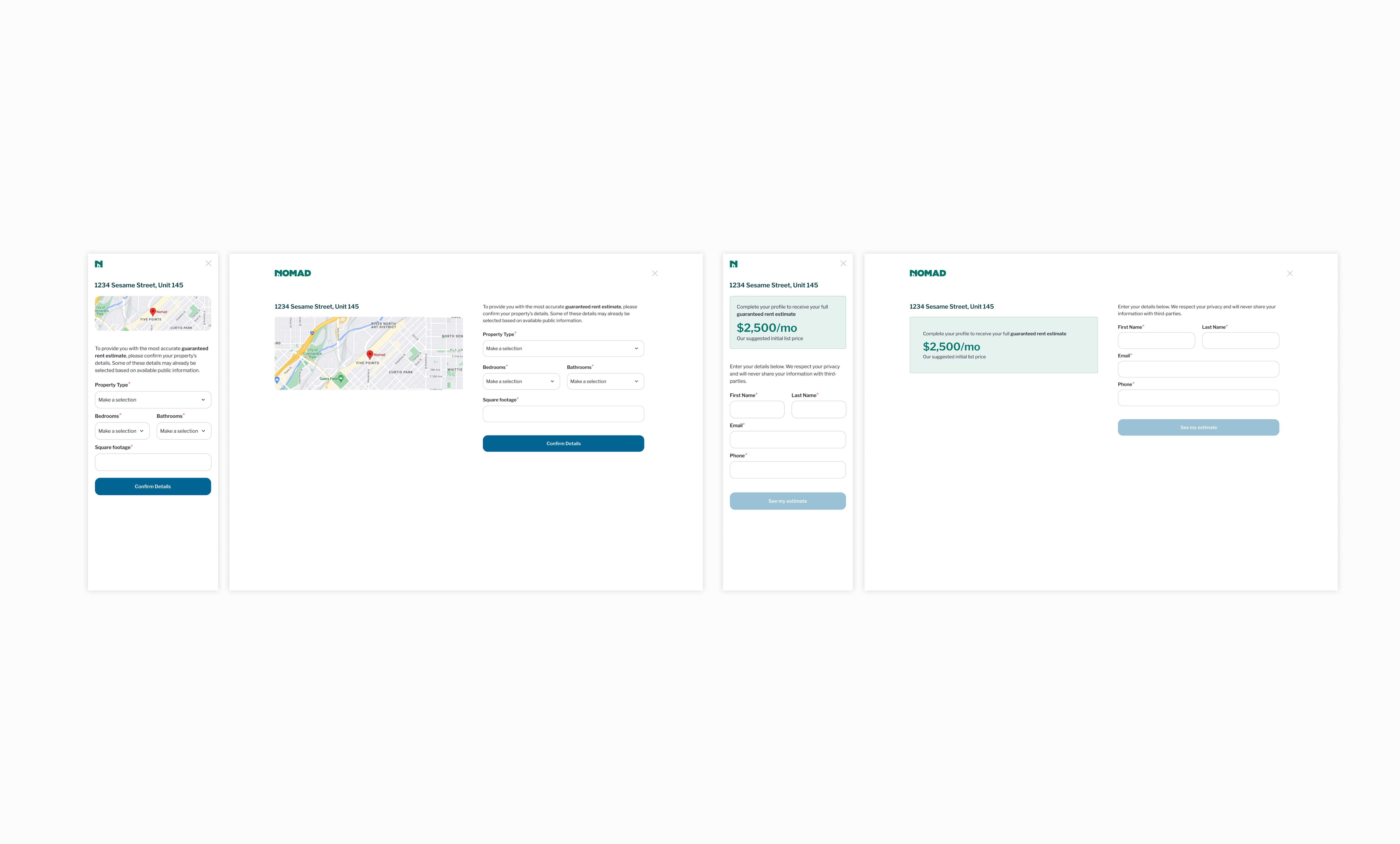
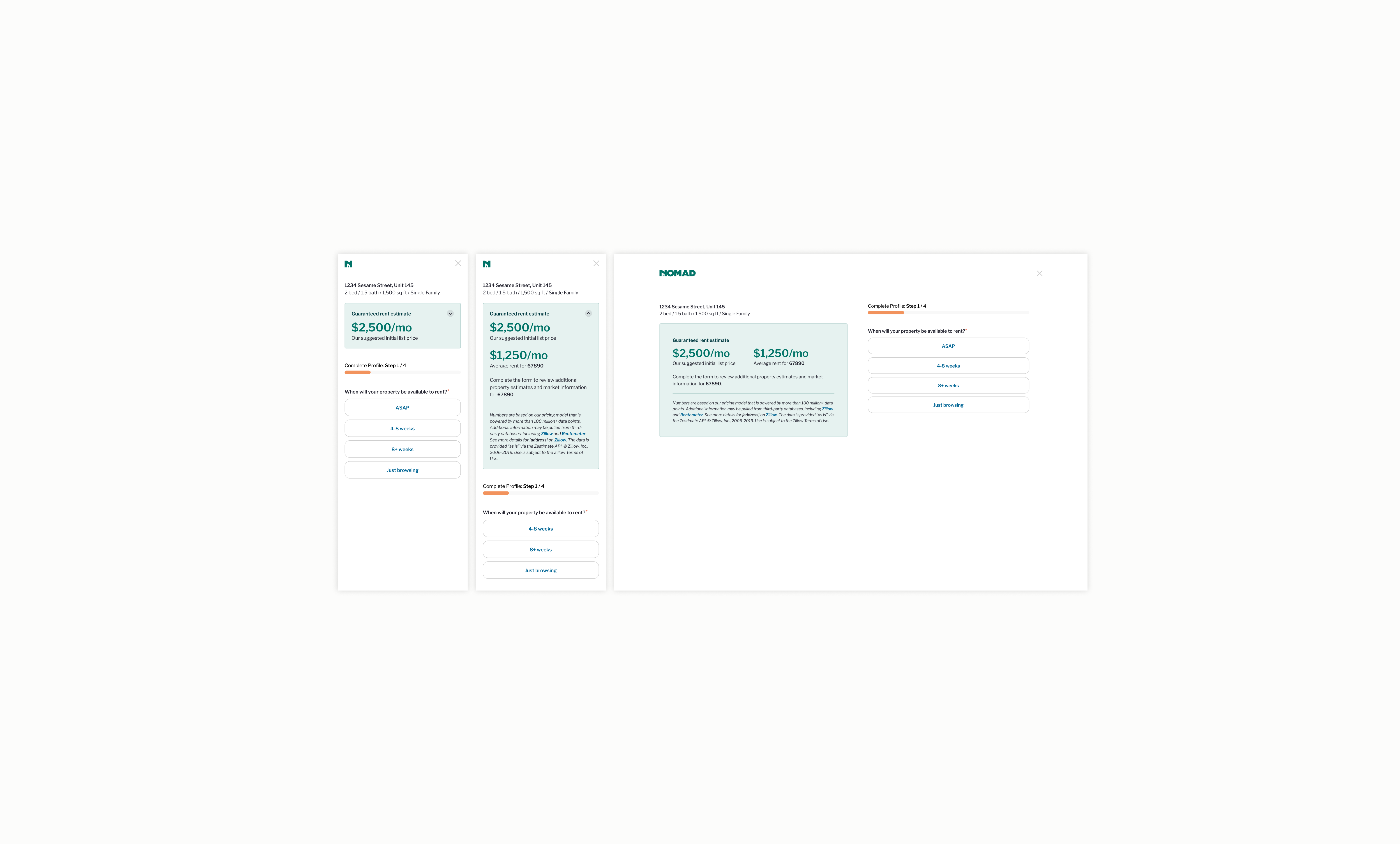
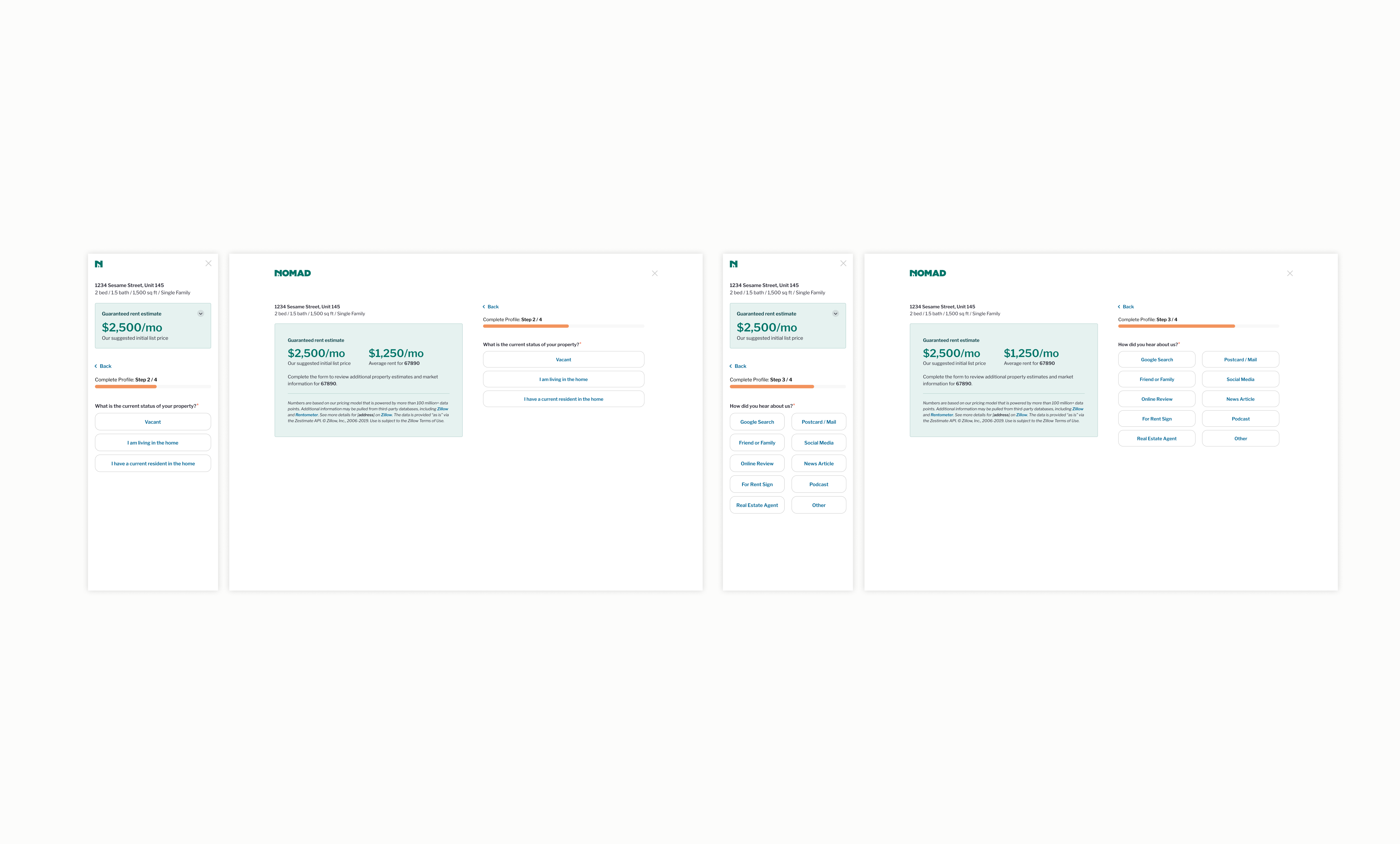
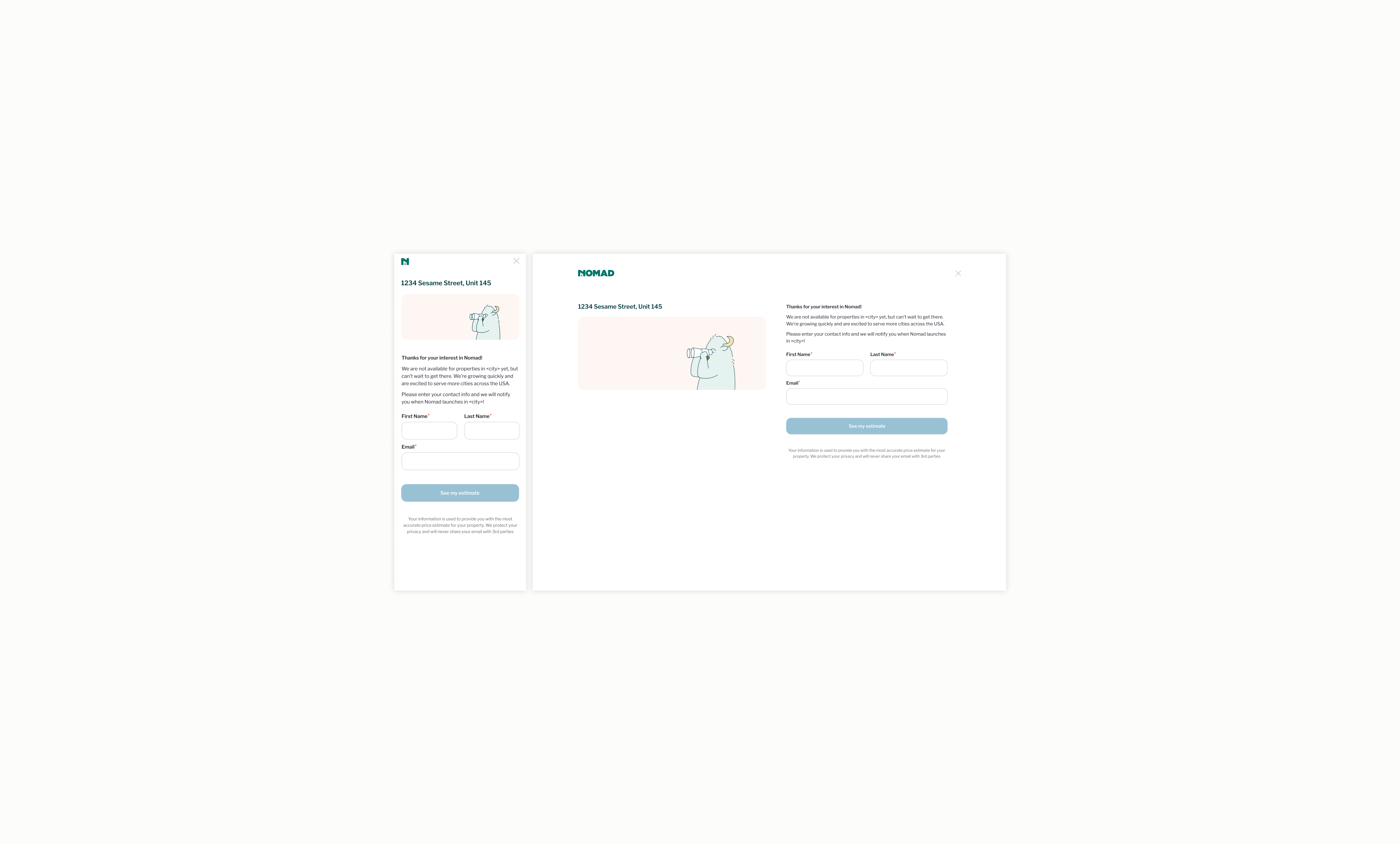
Nomad is a technology startup that helps property owners rent their properties on a long-term basis, guaranteeing a monthly rental payment for a small fee, regardless of vacancy or tenant issues. During my time at Nomad, I helped to improve the company's branding, increase focus on the mobile experience, develop a reusable system, and create a more self-service experience for customers. One of the first projects I completed was to help improve the lead conversion form to help the sales team achieve its aggressive monthly goals.
"All roads should lead to a logged-in state where we have more control over the customer's experience."
Increase form completions to help teams reach monthly goals.
Improve the overall mobile experience for a user.
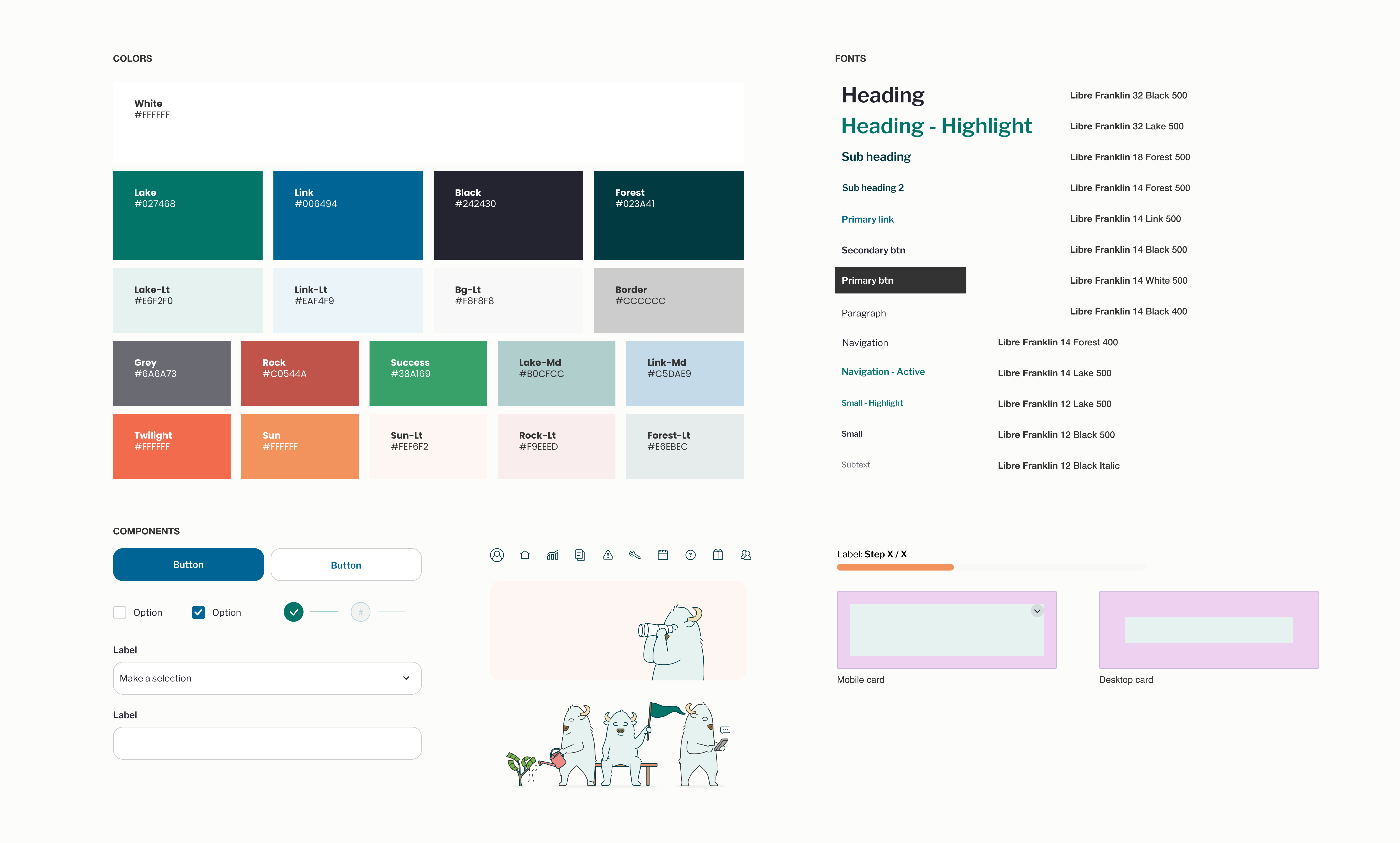
Begin to define and implement a design system that has purpose and personality.
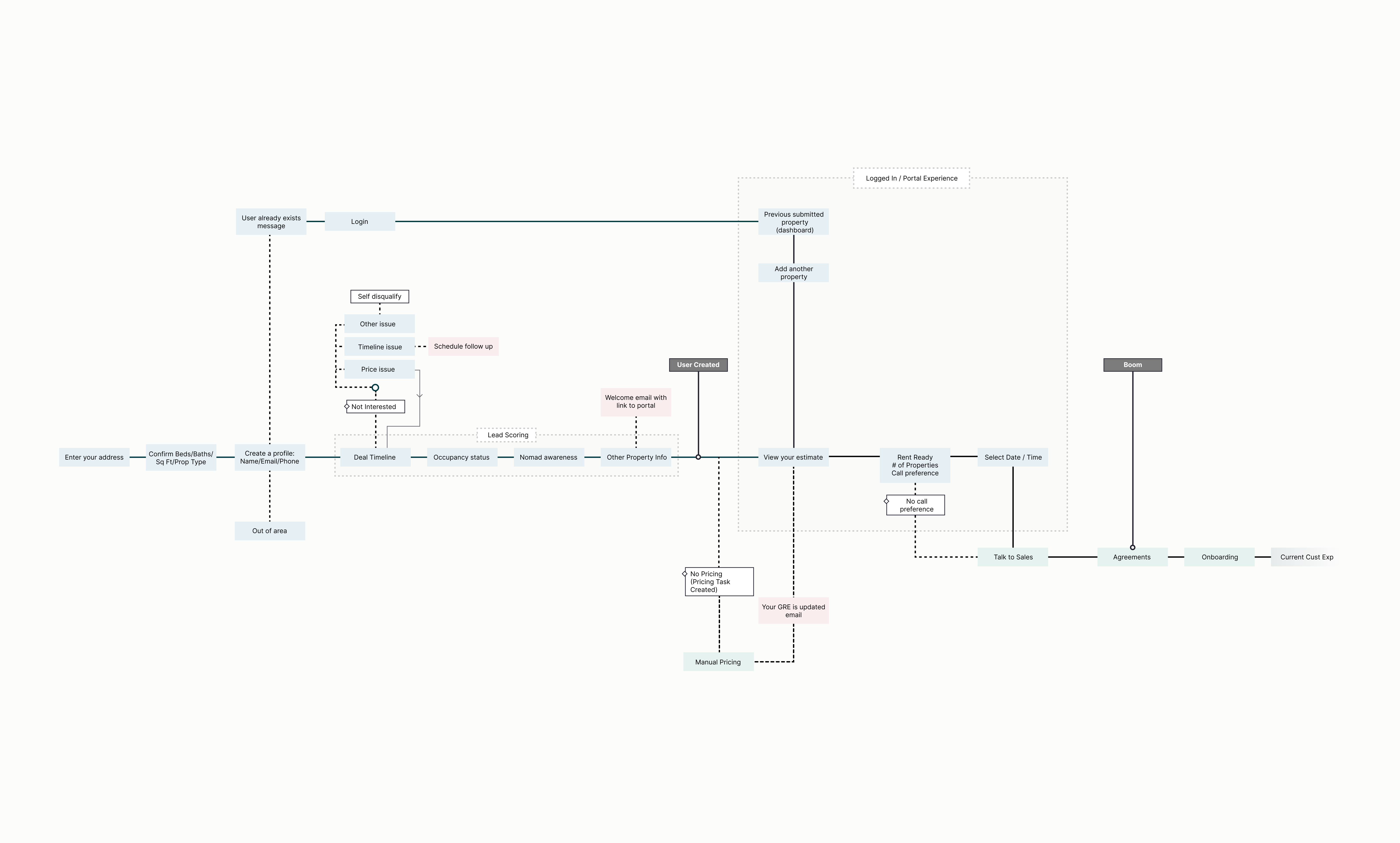
I began by understanding the product that currently existed and the purpose behind both the questions we were asking users and the intent around the current design. I had formal sessions with the Sales and Growth teams to understand how we were using these data points to score our leads for the Sales team to then prioritize. Through multiple conversations we found that we were collecting a total of 17 data points, but we were only using 10 data points to both score our leads and to complete any following up through our growth team for those users who exited the form.
From an experience and interface perspective, there wasn't a lot of purpose behind color use, consitency with fonts or components, especially when additional platforms were reviewed, including the website and the logged-in platform experience. Examples include the color green utlized for both interactive elements and for marketing centric spaces, and radio buttons used when checkboxes were the more appropriate solution.
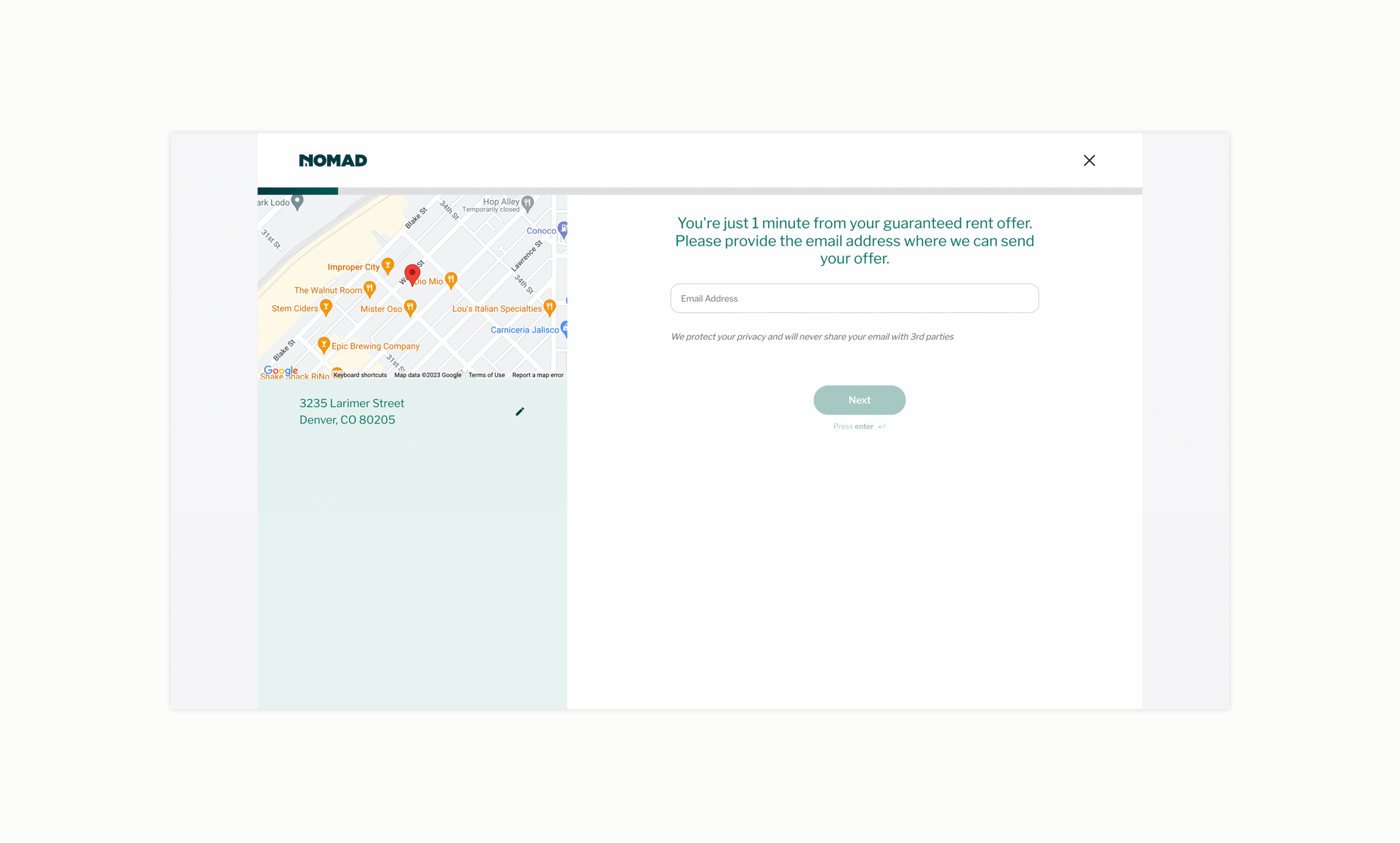
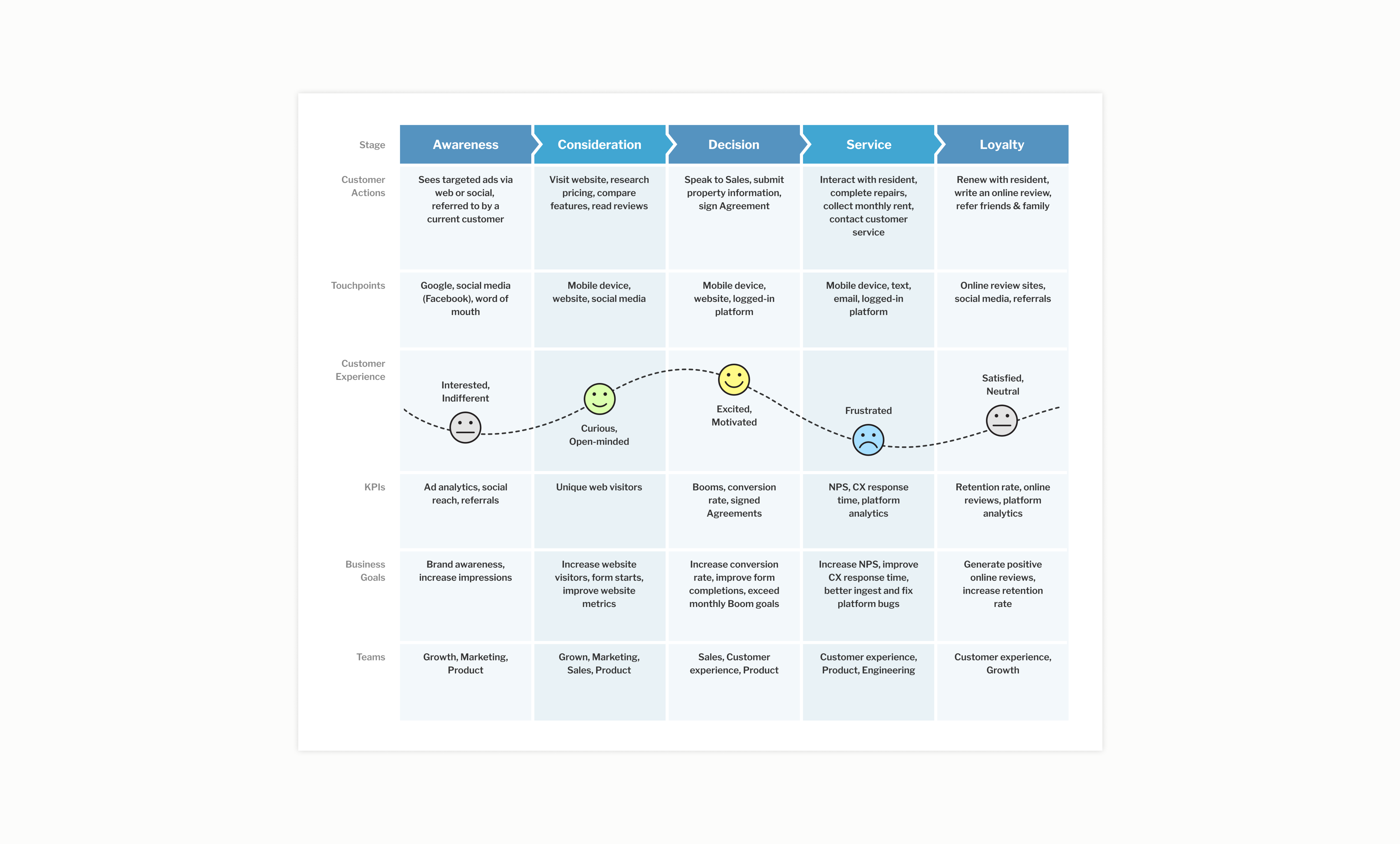
Working with Product, Growth, Sales, Customer Experience, and the Executive teams, I began to understand our target audience and helped to define what information we need, not just wanted, from a user to have a successful conversation that resulted in a new customer.
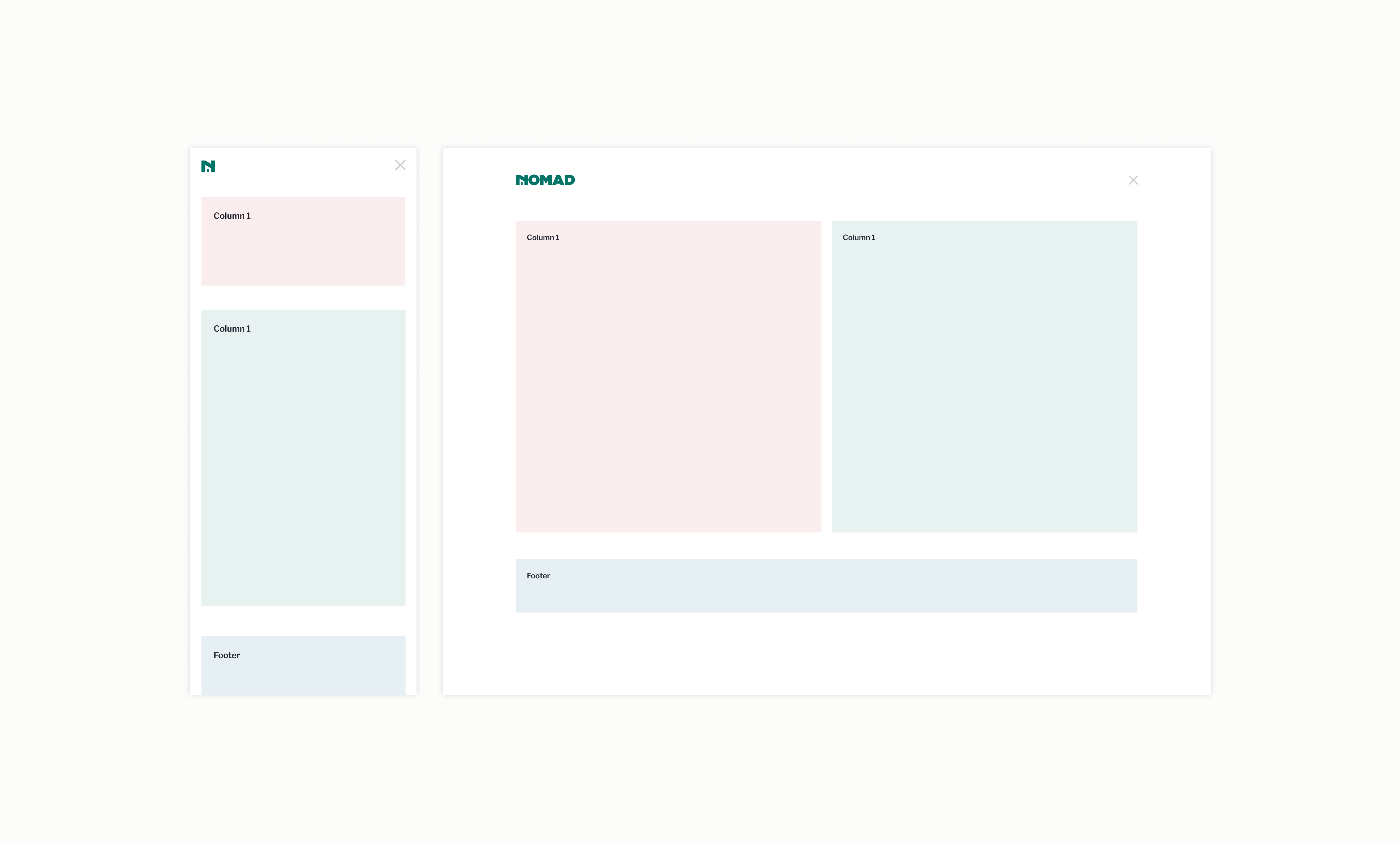
We designed a system, following a 12-column grid, that improved on the current styles, which had evolved over time with little oversight of a designer. Additionally, the visual contrast of the current styles (white, light blue, gray) failed contrast tests, so I focused a portion of the effort to improved the overall accessibility of the platform.
The engineering team was heavily involved in the creation and ideation of the design system, meeting frequently to review concepts locally before committing them to the codebase. Components were created to reuse throughout the platform, that would be implemented as new features were added to those sections.