research
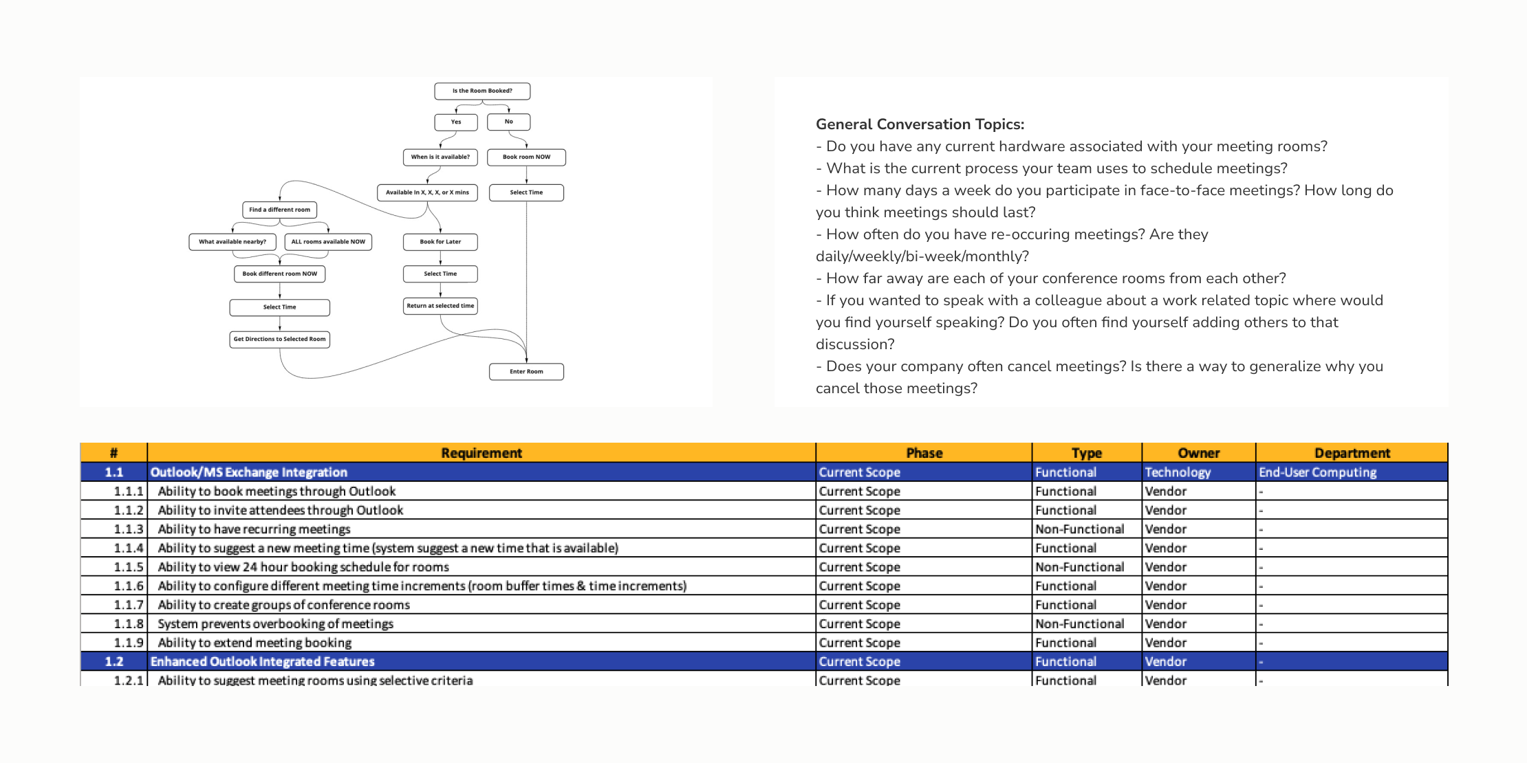
With the help of the internal sales teams, we were able to have working sessions with potential customers. We already understood the current pitfalls of the application, so we wanted to understand hollistically how we can find solutions. Without the involvement of the product, how they are currently using and managing their meeting rooms? Are the majority of their meetings formal or quick huddles? Are the rooms near each other or far away? Are the majority of their meetings re-occuring or singular? What is the smallest and largest capacity they have for a meeting room?
Some of these clients had already gone through the process to structure their data to integrate with other solutions in the marketplace that they were wanting to move away from. Being able to hear the process and pain points they went through to structure this data helped us define how our information could be organized.
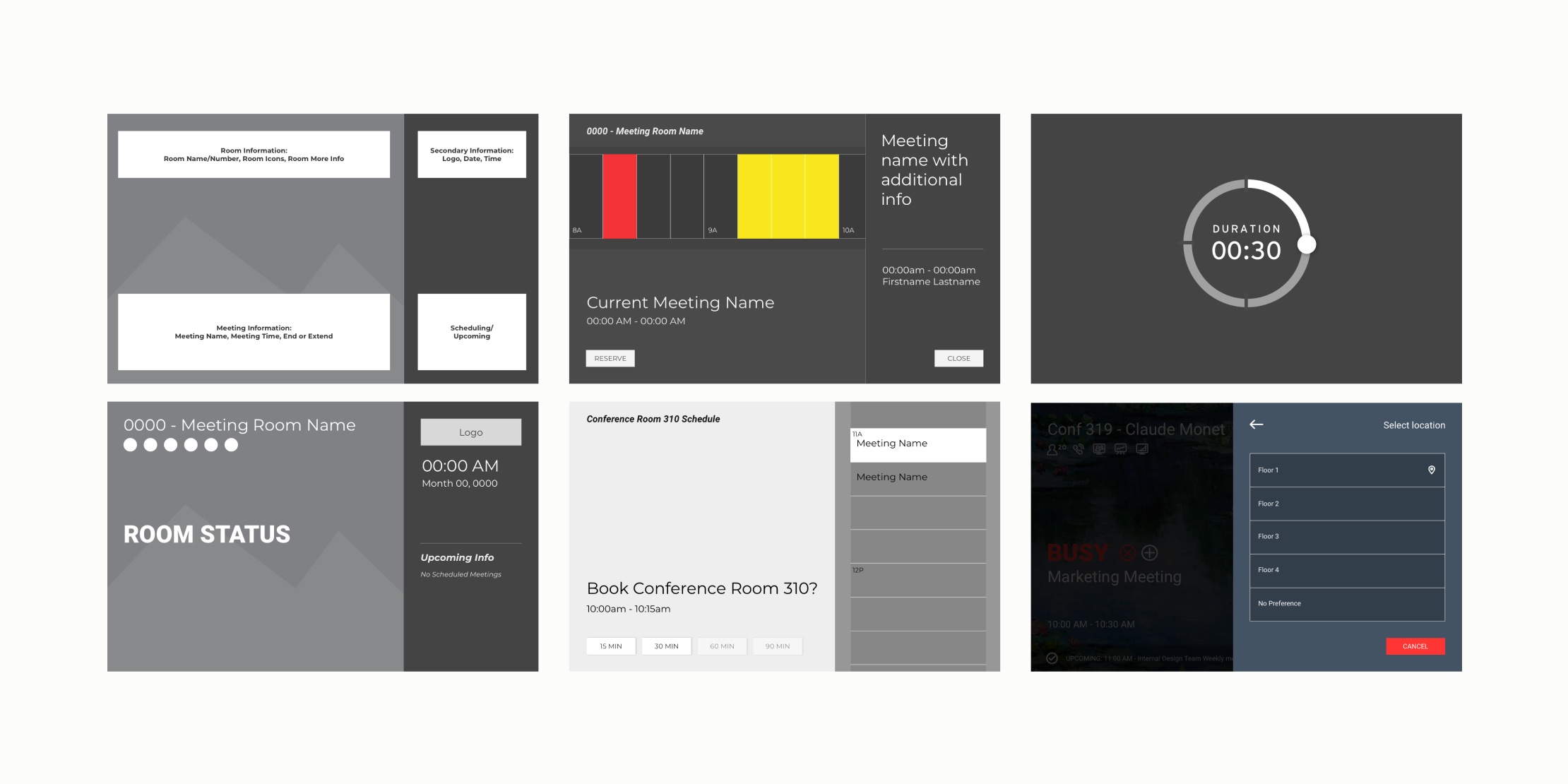
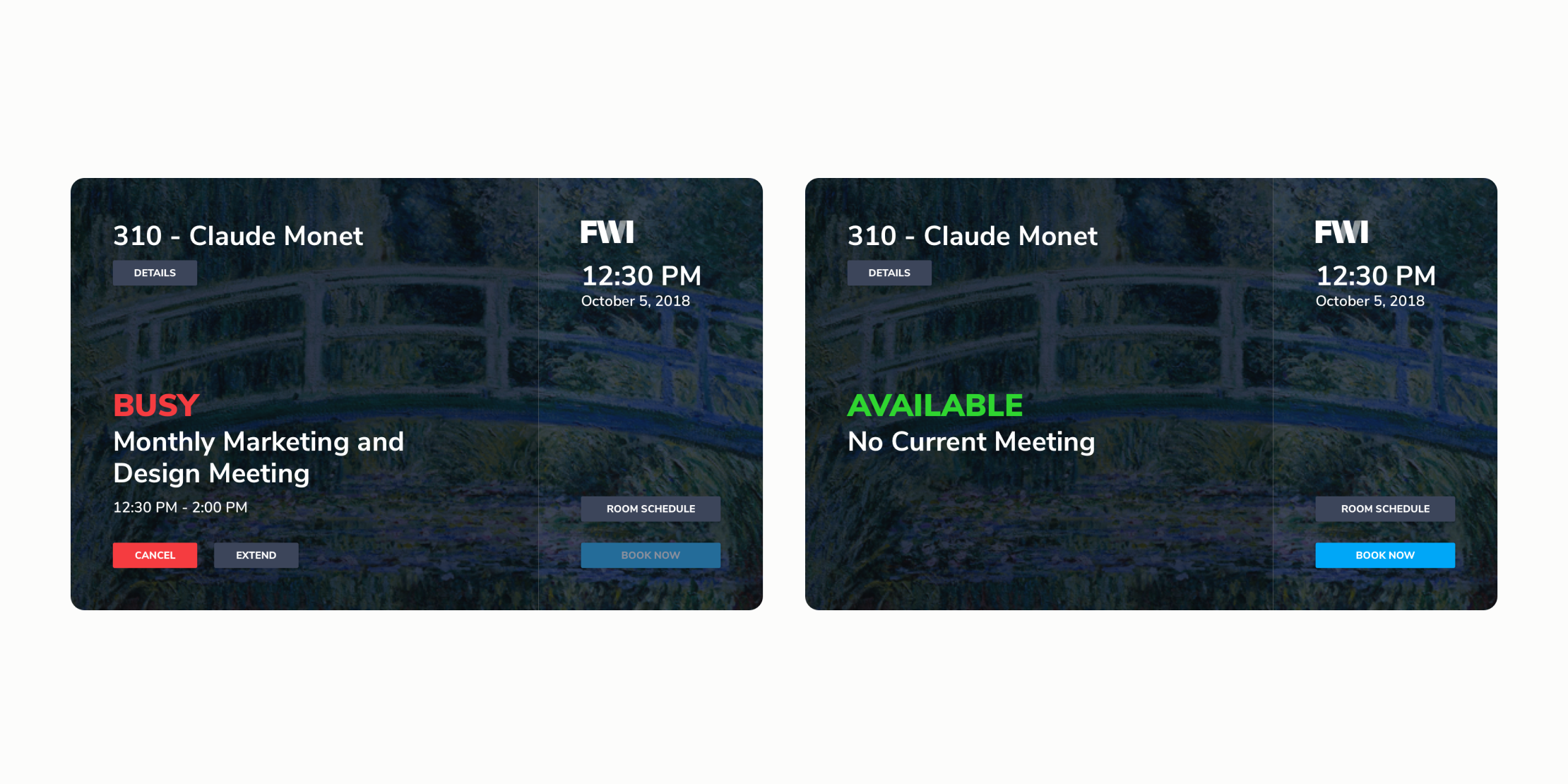
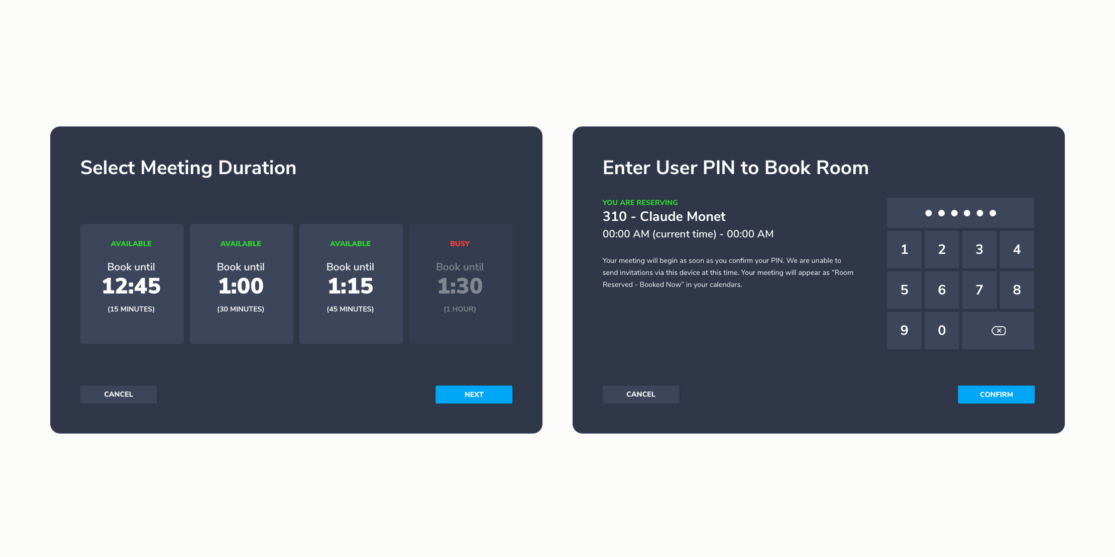
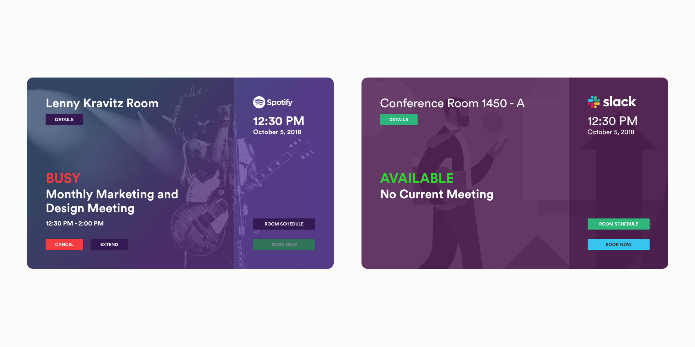
As a team, we mapped out the use cases we learned from our conversations while taking into account what could actually be accomplished using our core software platform. From these mapping exercises, we iterated on concepts that could be customized to match a client’s aesthetic while also remain out-of-the-box. What could we do that was still exciting? Throughout this process we gathered feedback from our internal sales, product, and design teams.
