Motili
Create a mobile-first, web product to serve as a qualified lead generator for the sales team and begin the company’s exploration into the direct-to-consumer market.
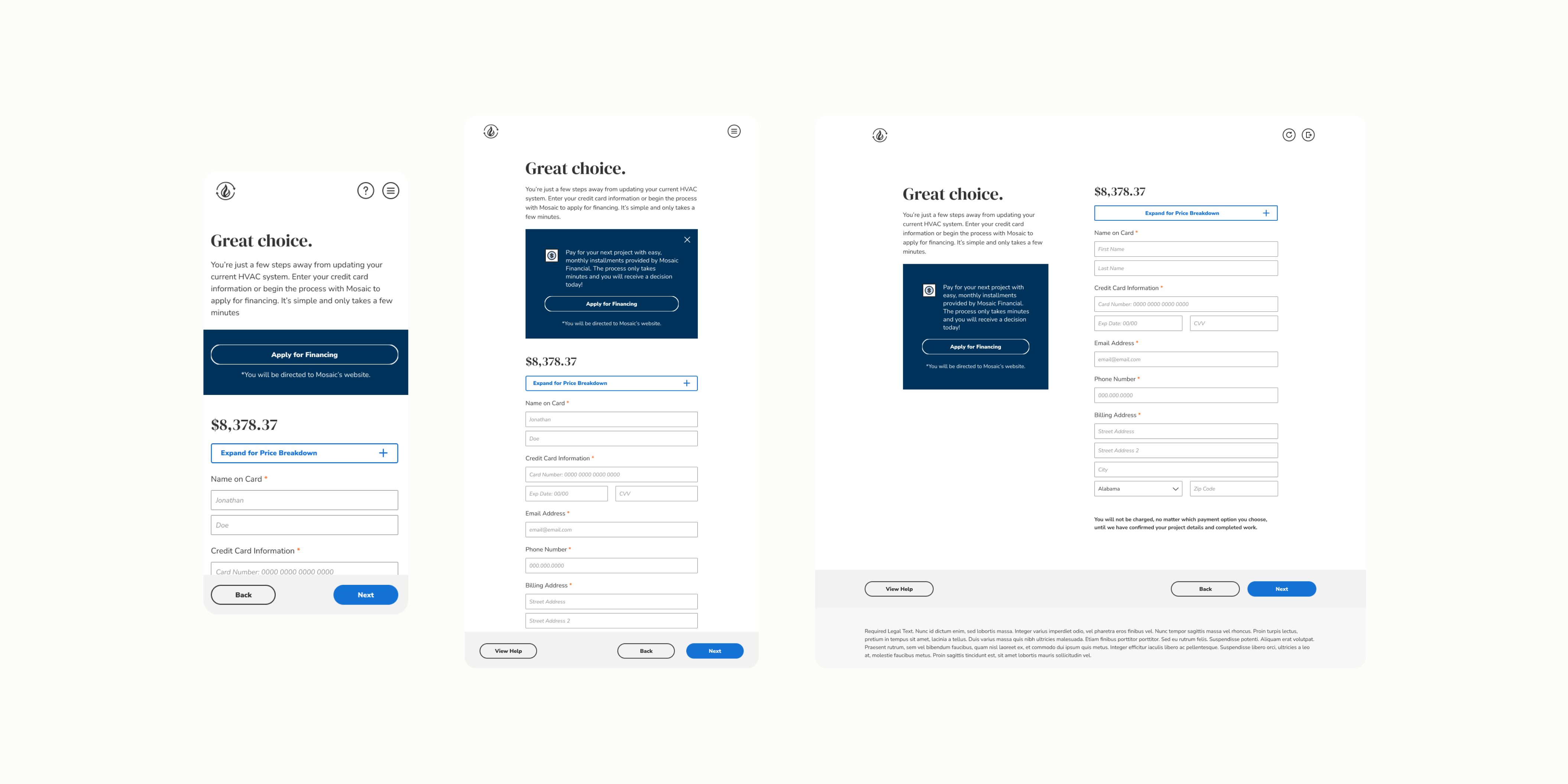
Prior to my involvement, the initial web product was a white-lable platform for resellers to use to market the company’s inventory. It was extremely targeted and wasn’t scaleable for large markets. The concept was also not able to qualify a customer financially or logistically (i.e. is our inventory compatible with their home’s setup). Additionally, the structure and design still needed to be flexible enough to continue to allow resellers to utilize and seem different but have the same experience.
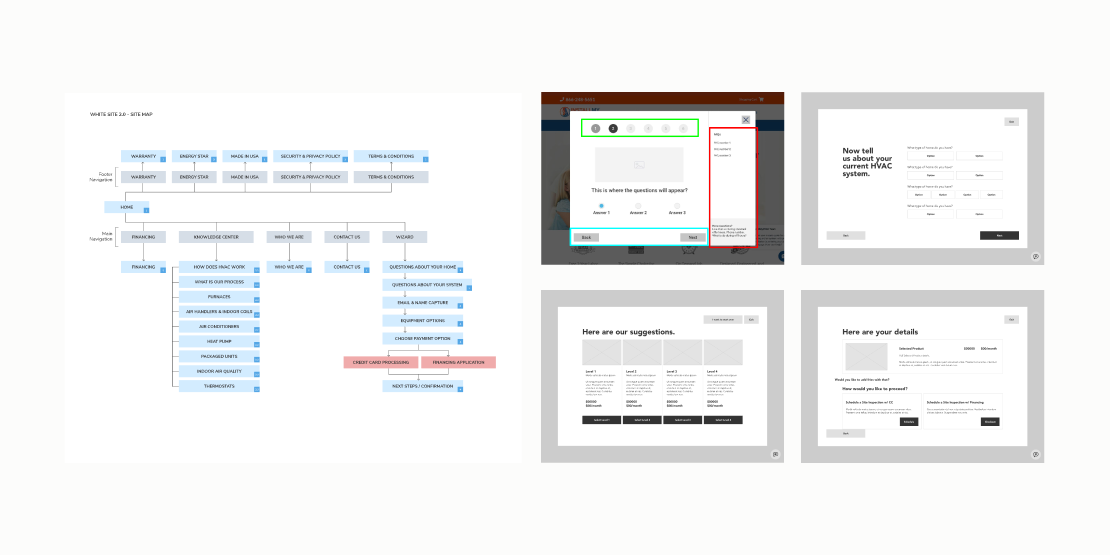
Initial discussions and whiteboard sessions included the product managers and designers. We defined the known needs from the sales team and how we can map out the website’s functionality so we solve immediate needs as well as the end goal of a direct-to-consumer product.
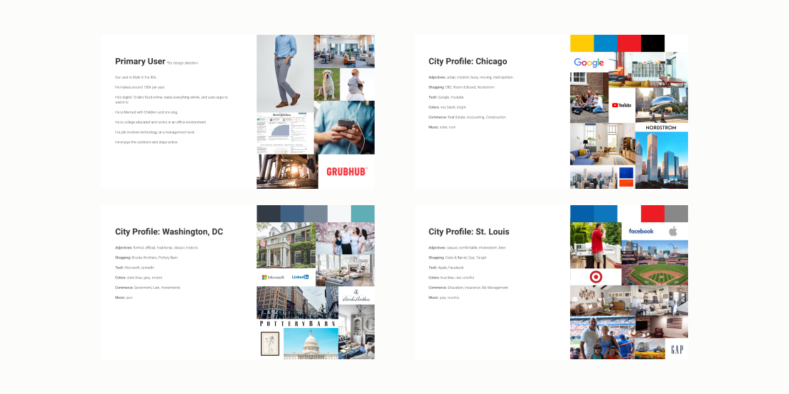
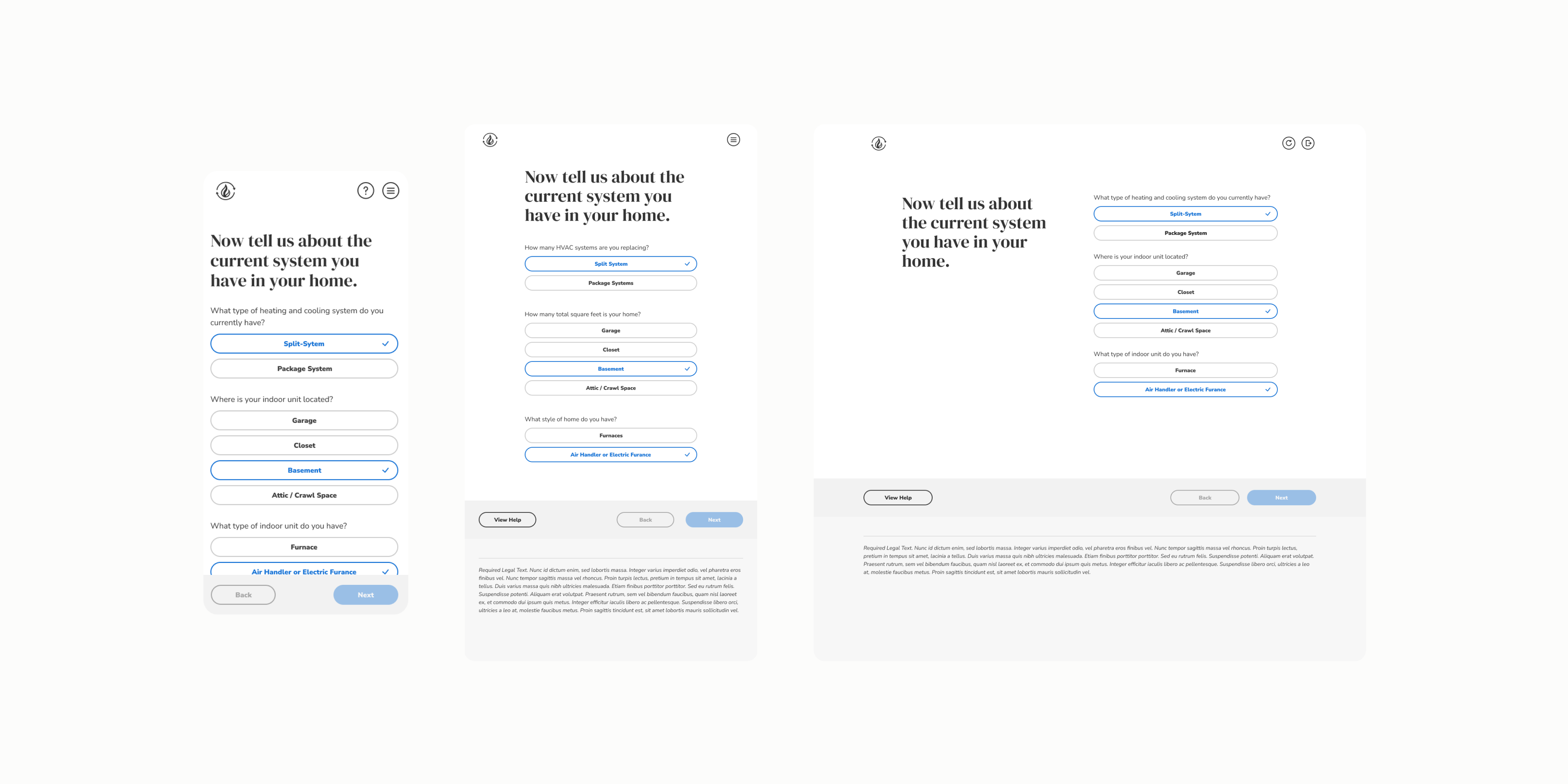
With the help of additional internal stakeholders, we discussed and defined who we thought our primary users or target audience would be. This helped the product team define features and create a scalable, modular experience that could work for multiple scenerios. How would a Newbie still get to a worthwhile endpoint while still allowing the full experience for a Buyer? How would they both still be considered a qualified lead?
From these discussions we mapped user flows and iterated on wireframes with the entire group, including an overseas engineering team. We gathered as much feedback and direction during this phase as possible prior to beginning any discussions around actual design aesthetics.
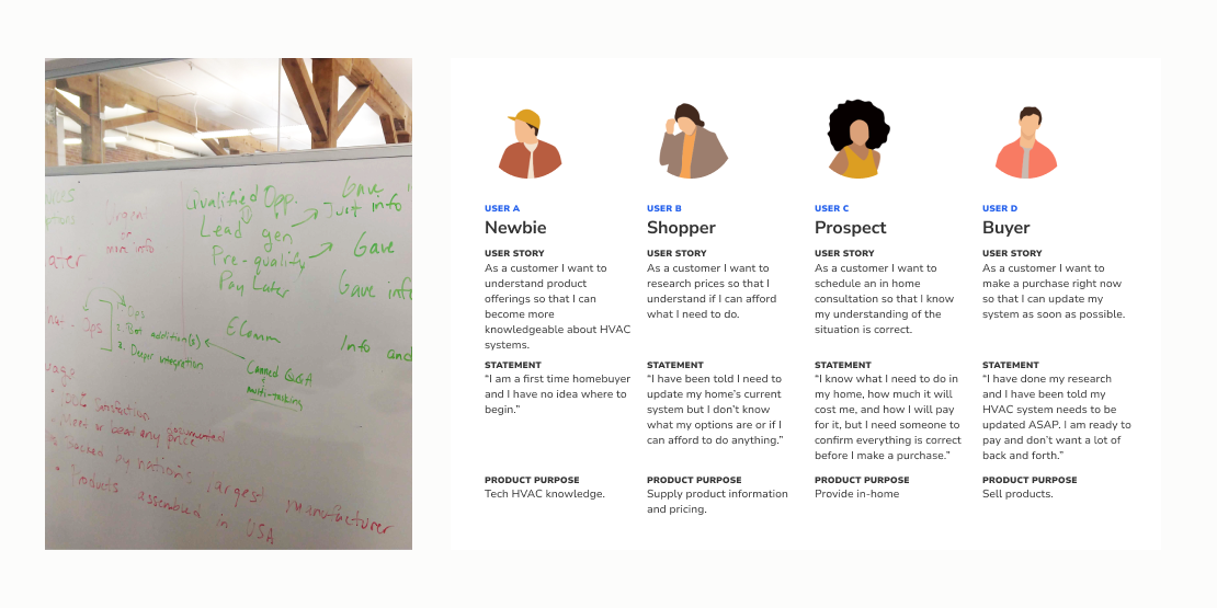
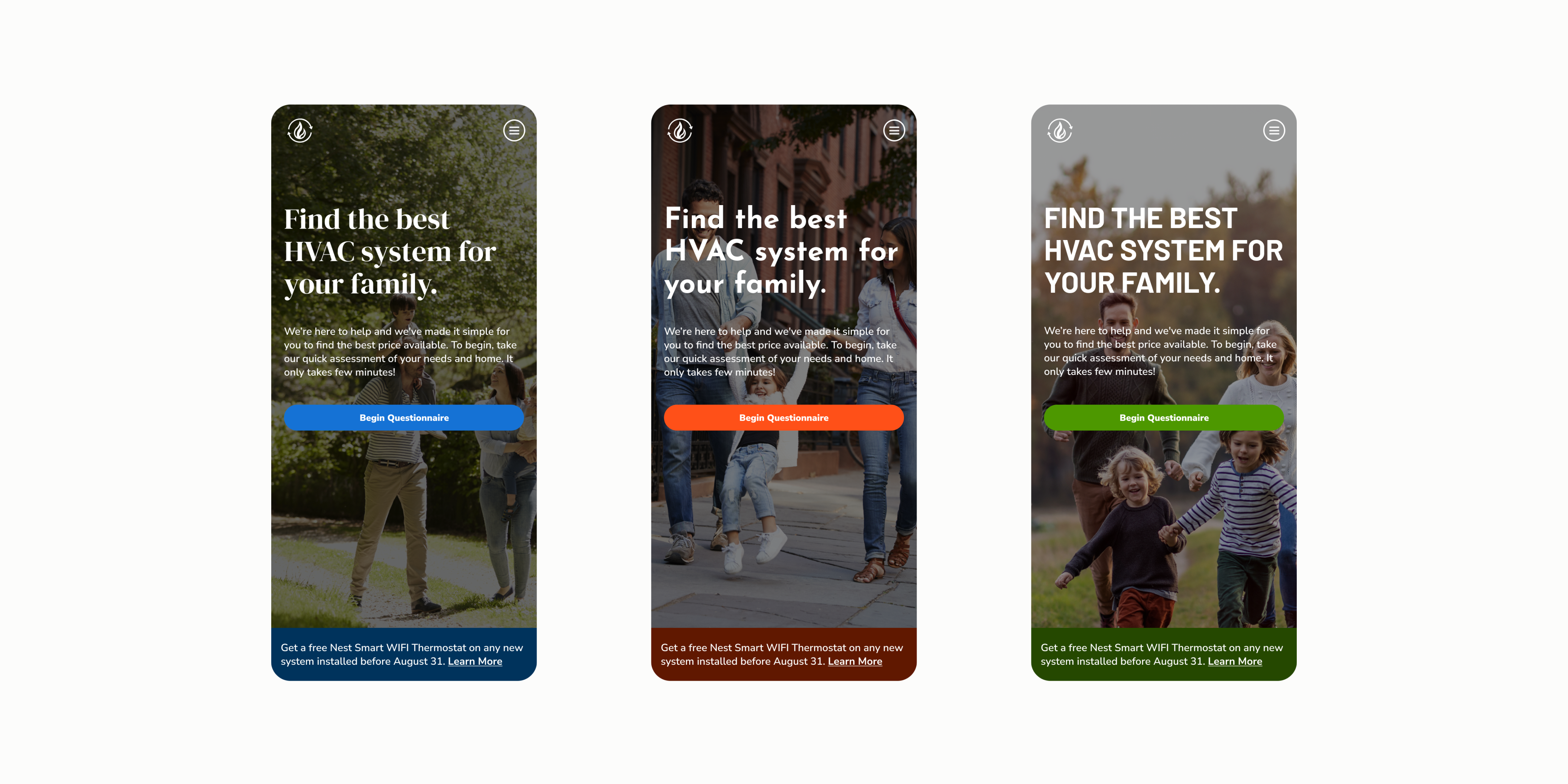
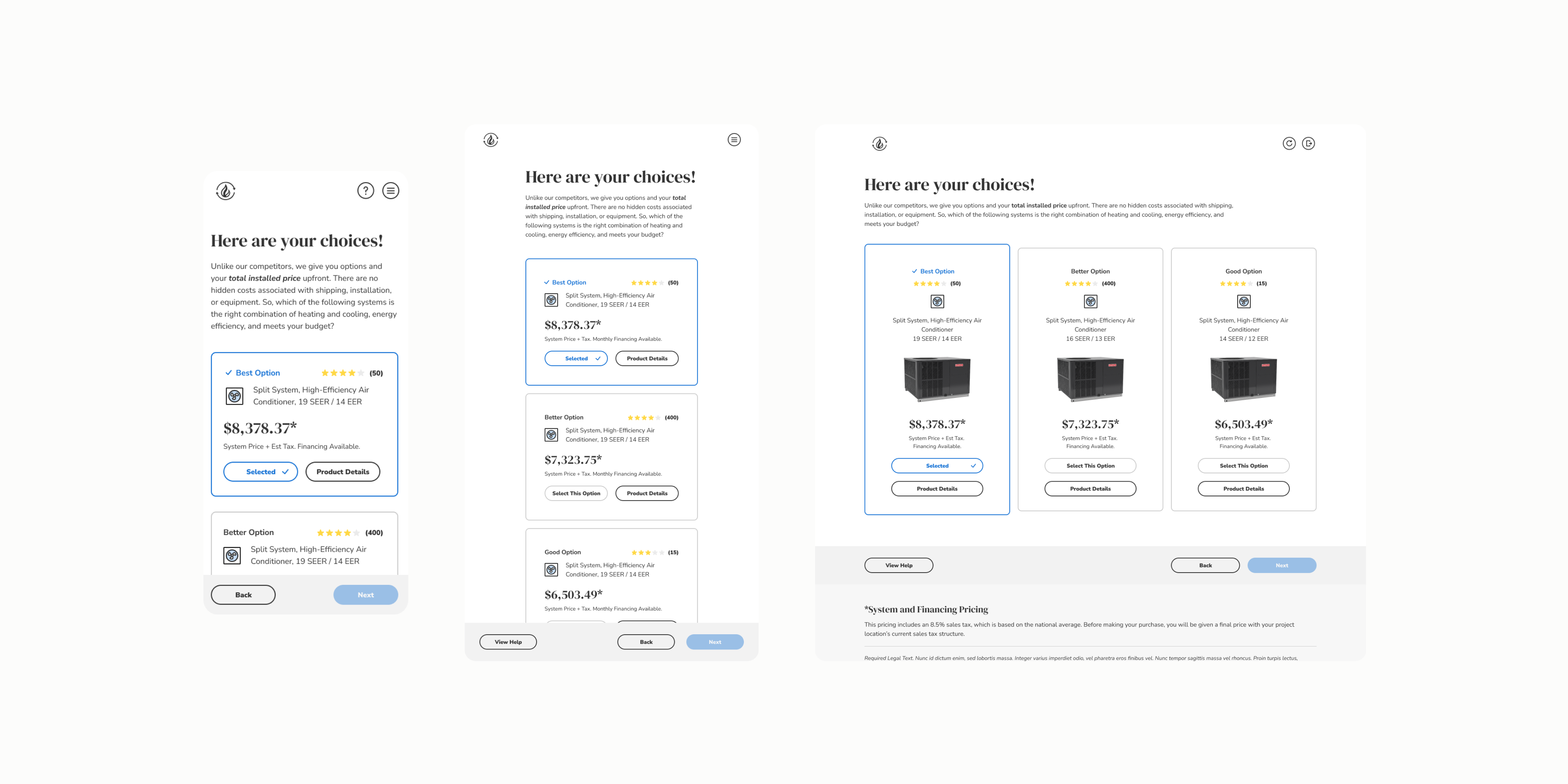
The sales team had three target markets and wanted three unique “designs” for each market. The scaleability of the design was already a product feature and everyone understood we didn’t have the time or resources to continously create fully custom experiences. I approached the design with a base target user and then built upon that with a “city profile” that pulled generalizations based on a region. These target users evolved based on feedback from the sales team and additional research.
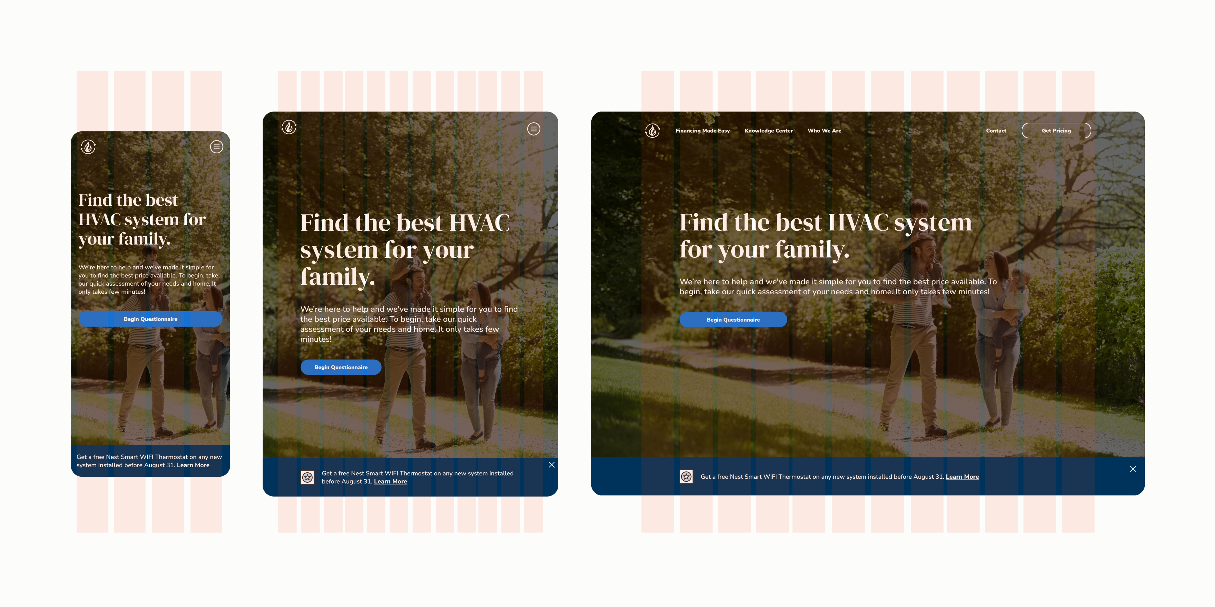
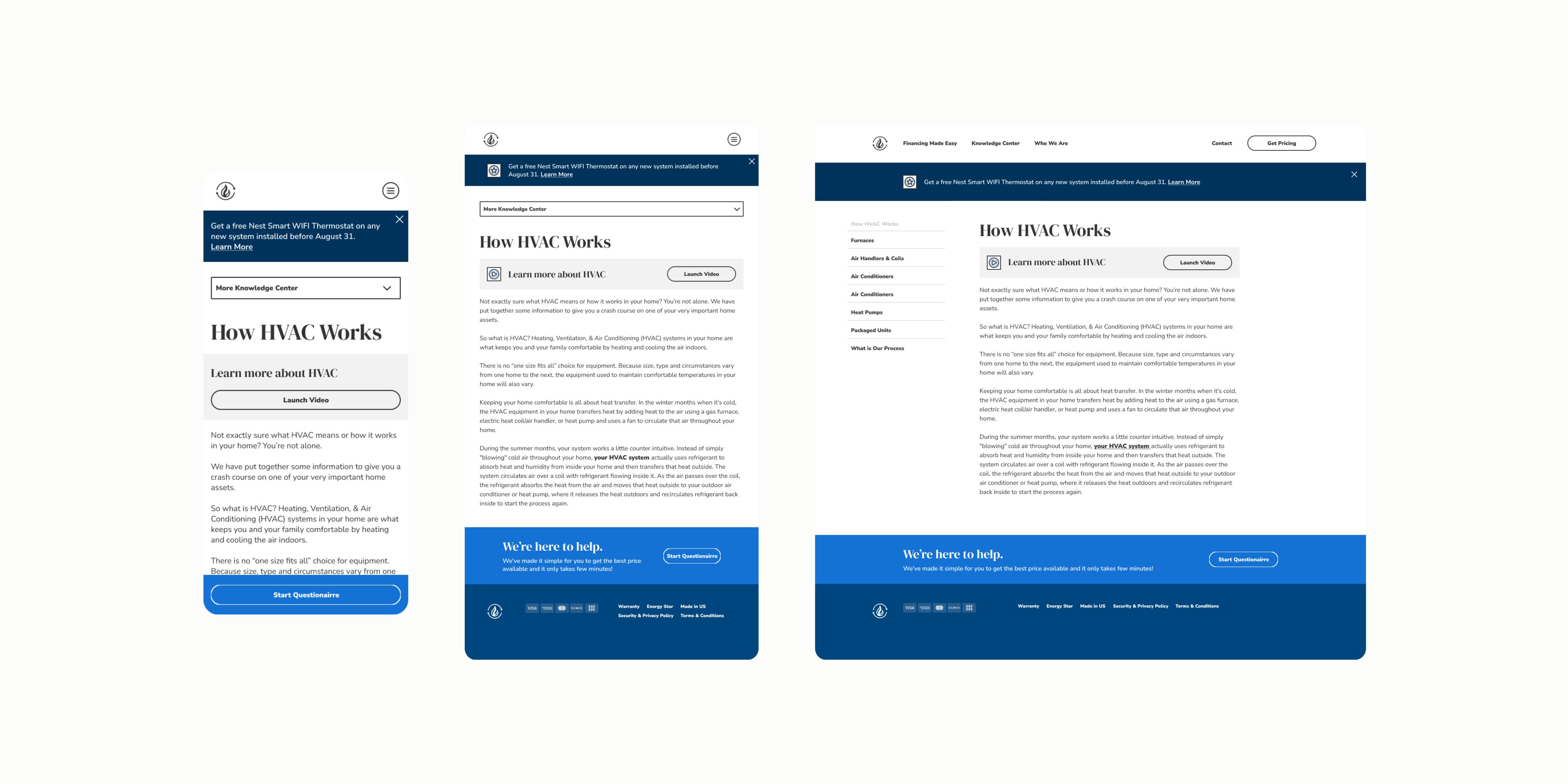
The pages and structure of the website also focused on a base concept and were built upon with design elements to feel custom for the target audience. The engineering team started with a base structure that defined all elements but didn’t style it. We later supplied styleguides for each market that incorporated styles like color, weight and font, as well as some content items such as photography.
The sales team and other internal stakeholders were pleased with the end result. Additional members of the team were hired to focus solely on these solutions and continue to drive functionality to meet the needs of the end goal of a more robust direct to consumer experience.